Instructional Design & Online Course Support

University of Wisconsin

  • Home
  • Contributors
  • Course Design
  • Online Teaching
  • Tools & Technology
  • Policies & Procedures

Color Blindness and How It Affects Your Learners

Posted: March 27, 2017 | Last Modified: November 8, 2018 Leave a Comment

Color blindness is a condition where someone can not distinguish between certain colors, often between greens and reds, and very rarely, yellows and blues. One common form of red/green color blindness is called deuteranope.

Below are a few suggestions for how to communicate without depending on color alone to differentiate or convey information.

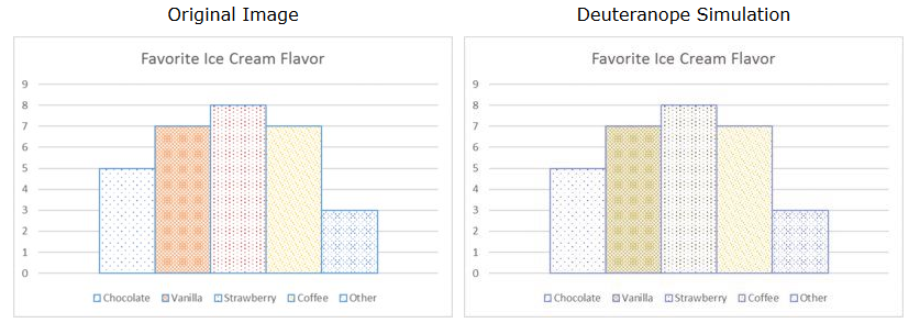
Use pattern fill for charts

The chart on the left is how the chart looks to someone who is not color-blind. On the right is how the same chart might look to someone with color-blindness (courtesy of a tool called Vischeck). It is more difficult for a person with red/green color blindness to differentiate the middle three chart segments, especially if lighting is not optimal for reading on screen.

Graph with five bars; the left graph has blue, orange, red, and yellow colors. The orange, red, and yellow bars look like shades of green.

You can use pattern fills to ensure that the information conveyed in the chart is easier for color-blind students to interpret.

Graphs with pattern fill

Use font styles

Here is an example of a news item where the writer used red and green font colors. The red and green sentences look like they are the same color to the color-blind student. If the author was trying to color-code information, a color-blind student will not be able to differentiate. Instead, it is best to underline, italicize, or bold text to differentiate information, but use it sparingly.

Use icons to convey meaning

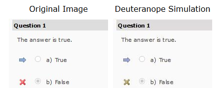
Depending on a students’ color-blindness, they may not see the red “X” next to an incorrectly answered question as a red. Fortunately, the LMS does not just use color to note correct and incorrect responses. Instead, it uses two different icons to convey two different meanings; an arrow for the correct answer choice and “X” for the incorrect answer choice.

Screenshot of D2L quiz question that a student answered incorrectly. On the left, the red arrow looks red; on the right the arrow looks green.

These are tips that can benefit all students, not just those who are color-blind. When in doubt, use a tool like Vischeck to see how your image, chart, graph, etc. will look to someone who is color-blind.

Additional resources:

  • Nuts and Bolts: Do You See?
  • Seeing Differently: Designing for Students with Colorblindness and Low Vision

Filed Under: Course Design, Standards Tagged With: Accessibility, Instructor, Multimedia

Leave a Reply Cancel reply

Your email address will not be published. Required fields are marked *

About This Blog

Through the partnerships we form with our instructors, we develop engaging and interactive online courses. Here you’ll find ideas on course design informed by the latest research and teaching strategies that build community and instructor presence. We’ll also we share our experiences with technology, with Canvas, and with administering our online educational programs.

Affiliations


Tags

Academic Integrity Accessibility Announcements Assessment Canvas Copyright Design Fundamentals Discussion EDI Evaluations Extra Credit Feedback Fundamentals Grades Groups Instructor Instructor Presence Kaltura Kaltura Capture Learning Materials Learning Objectives Multimedia Notifications Open Educational Resources (OER) Quick Tips Quizzes Reflection Rubrics Social Presence Student Syllabus Troubleshooting Turnitin Written Assignments

iDocs · Schneider Social Science Hall 115 · University of Wisconsin-Eau Claire College of Business · BIZHELP@uwec.edu

Copyright © 2014-2023 UW-Eau Claire and the Board of Regents of the University of Wisconsin System

Copyright © 2023 · Metro Pro Theme on Genesis Framework · WordPress · Log in